Retro future queen: the QE2's brief heyday as a 1960s design icon.
For three years after its introduction in 1969, the QE2 was the floating embodiment of that bizarre age.

Fifty-four years ago today, on May 2, 1969, the Cunard ocean liner/cruise ship hybrid Queen Elizabeth 2, known for much of her career as the QE2, departed on her maiden voyage from Southampton, England. At the time she was introduced in the late 1960s, the QE2 was thought to be pretty much the final chapter in the story of the floating-palace passenger liners of yesteryear which had begun in the late 19th century, and largely ended in the 1950s and 1960s as jet planes replaced ocean liners as the chief means of travel between continents. The QE2 was intended to be the "last hurrah" of this golden era, and as such her look and design was intended to be the exemplar of modernism as it existed at that time. Ocean liners, and particularly their interiors, were showcases of cutting-edge artistic design. In the QE2's case, the weird aesthetics of the very brief window in time in which she debuted made her a curious, and curiously short-lived, icon of design as it existed circa 1969. It only lasted a few years, much shorter than the ship's long career. But remembering the original QE2 is a fascinating look into this period, now half a century in the past and gone forever.
Aesthetically, the QE2 was the brainchild of two iconic British designers. James Gardner designed the ship's exterior, which was meant to evoke a sleek yacht rather than a traditional ocean liner. Gardner had worked for the UK's Ministry of Information during World War II, designing posters to aid the war effort, and he also designed dummy tanks and other fake equipment to fool Nazi intelligence in the run-up to the D-Day invasion. The QE2's interiors were designed by Dennis Lennon--no relation to the Beatle--who had by the late '60s done a number of iconic architectural design projects, such as the Chalcots Estate towers. Their charge was to design the new liner as an inviting party space, but also a mighty achievement of British modernism, improving and updating the traditional staid look of British ocean liners. They answered this call, but they did it almost too well. The QE2 and its modern design made a big splash upon the ship's debut in 1969, but didn't end up lasting very long.

Dr. Stephen Payne, who helped design Cunard's revival ocean liner Queen Mary 2 in the early 2000s, remarked in 2018 on the QE2's contribution to ocean liner history. He said:
"Cunard wanted to completely break with all their tradition and history. They saw the QE2 as taking a modernist approach and even had an advertising campaign that said ‘ships have been boring long enough.’ The look was unlike anything Cunard had done before, although it was a pure 1960s look and I think parts of it did date quite quickly.”
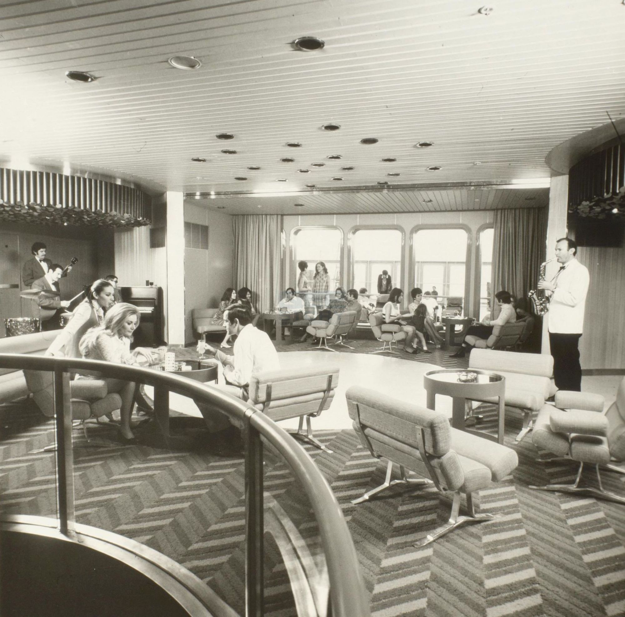
Dated, it definitely was. Check out the original appearance of the Double Up Room Bar, pictured above. The chairs look a little like the ones on Clavius Moon Base in Stanley Kubrick's film 2001: A Space Odyssey, released as QE2 was being fitted out. That style of "futuristic" seating--not very comfortable in the real world--was hot right about 1969, but not for long after it. Also notice the shag rug with geometric designs and the shiny-edged windows looking toward the exterior of the vessel. Though not a feature of the design obviously, I wonder what that man is doing wandering around randomly playing the saxophone. Shouldn't he be on the bandstand?

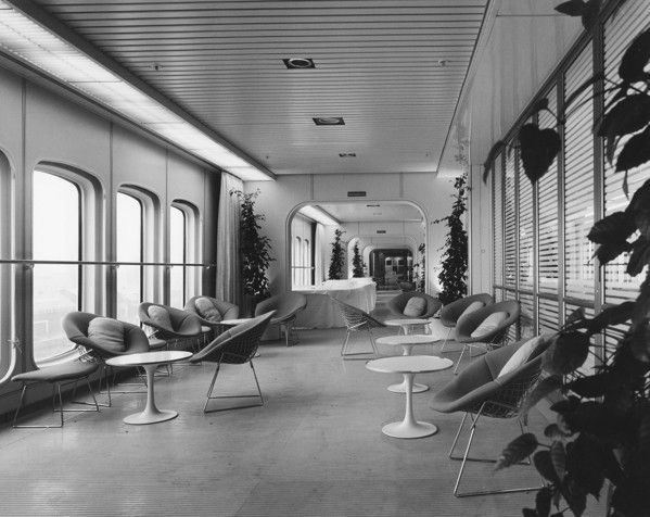
For a stranger example, look at the promenade area outside the Queen's Room, above. The hallway, again, looks a little like 2001: A Space Odyssey, perhaps the spaceship Discovery or, better yet, a Star Trek set. The round, barely-padded half-moon chairs are set on cheap wire frames that are barely more than overgrown paper clips. I had one of these sorts of chairs in my dorm room in 1991 and I can attest from personal experience that they're so uncomfortable as to be low-grade torture devices. The addition of the plants don't help much. This space is supposed to be strikingly "modern," but in fact looks sterile and off-putting. This was definitely not what Gardner and Lennon intended, but it looks that way to us because we, 50 years on the other side of this kind of design, now recognize it as embarrassingly retro.

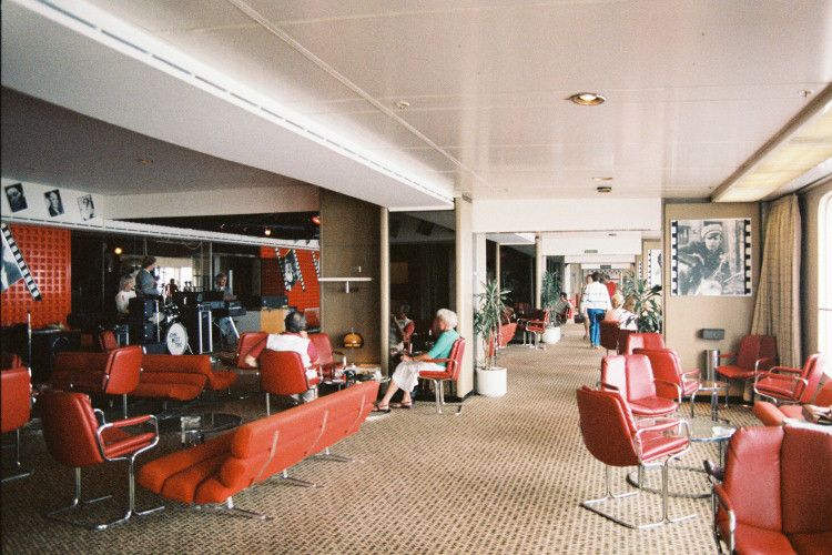
This incarnation of the QE2 was quickly dispatched to design oblivion. In 1972, only three years after her introduction on the North Atlantic, QE2 was refitted and a lot of the original interior design elements were replaced, such as the Theatre Bar, which with its brown carpet and red leather chairs was even more garish than most public spaces onboard. Why were these elements replaced so quickly? Fifty years after the launching of the ship, the Glasgow School of Art opened an exhibit that looked back to what the ship had looked like then and what an unusual achievement she was at that time. On the occasion of the opening of this exhibit, Dr. Bruce Peter, a professor of design at Glasgow School of Art, remarked:
"The QE2 was one of the masterpieces of 1960s design. From the industrial design of the exterior, right down to the ashtrays and door handles, it was a remarkable achievement. The irony is that such a brilliant piece of design only lasted in its original incarnation for three years. By the 1970s, people wanted a more retro experience."
The truth was, the QE2 as a late-sixties icon was bold and modern in a design sense, but not very inviting in a commercial one. Cunard had, to a certain extent, gotten a little far out over their skis in terms of trying to turn the page on the design of ocean liners of the past. In 1969, the great superliners of the 1930s and 40s, Queen Mary and the original Queen Elizabeth, had been retired for only two and one years, respectively. The British public still fondly remembered those ships and some actively mourned their passing. An "ocean liner" in popular memory was a space with mahogany paneling, Art Deco styling, frosted glass light fixtures and a pleasing traditional style. Red leather chairs from Moon Base Clavius were just too far a leap from this aesthetic. Consequently, QE2's interior modernism was toned down--but, one could argue, greatly to her cost.

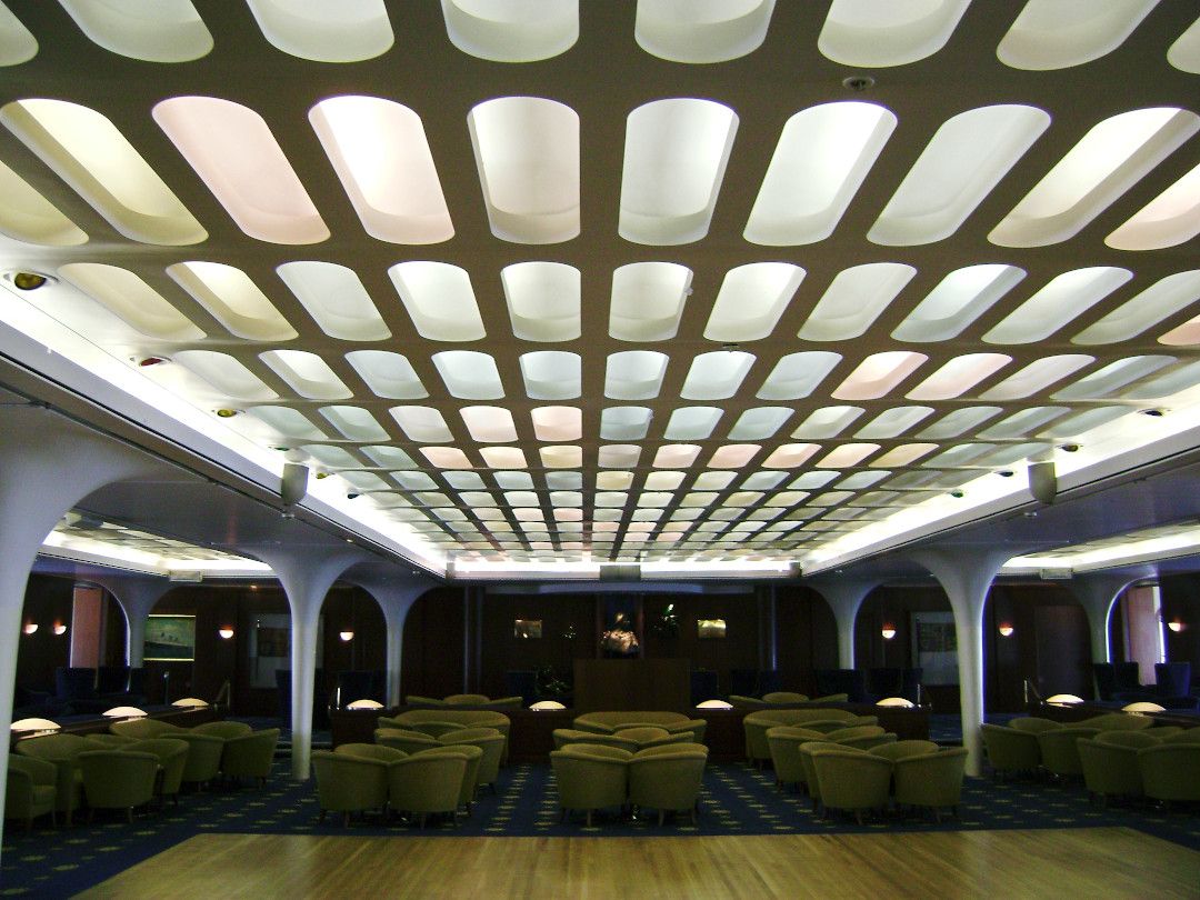
Look, for example, at the above photo, which was taken in the 1980s or early 1990s. This is the interior of the Queen's Room, one of the QE2's main public spaces. In 1969 this looked like a space station, with as much chrome and plastic as Gardner and Lennon could cram into the space. Twenty-five years later, though, you can still see the retro-sixties look in the shape of the light panels and the columns, but the furniture and light fixtures have more of an Art Deco throwback look and are considerably less flashy and garish than you would have seen in 1969. As a result, this space looks strangely conflicted. Its designers wanted modern, but, as it turned out, not too modern. Queen Elizabeth 2 seemed to be yearning for a return to the past, despite having been built as a bold new vector into what seemed, at the end of the Aquarian sixties, like the future.
Though well-liked, QE2 was never beloved the way the original Queen liners were, or even, arguably, as the Queen Mary 2 has been. Once the last survivor of the passenger ships plying the North Atlantic--at least in summer--QE2 made her last paying voyage in 2008, and then entered the grim Hunger Games-like survival sweepstakes that various retired luxury liners have gone through before. That cycle goes something like this: a new owner buys the ship with grand plans to turn her into a hotel or convention center, gets stuck with a multi-hundred-million dollar tab to restore and maintain her, owner goes bankrupt, the ship is sold for scrap, then is rescued from the scrapyard at the last second by another new owner with grand plans to turn her into a hotel or convention center...rinse and repeat. Currently, QE2 is beating the odds as a four-star convention hotel in Dubai. How long will that last? Time will tell. A ship like this is always one economic downturn away from the scrapyards of Alang, India. I hope QE2 will survive obviously, but even if she does, she will be only a shadow of what she was like in those first heady days of her storied career.
The Value Proposition
Why should you be reading this blog, or receiving it as a newsletter? This is why.
☕ If you appreciate what I do, buy me a virtual coffee from time-to-time to support my work. I know it seems small, but it truly helps.
📖 You could also buy my newest book.
🎓 Like learning? Find out what courses I’m currently offering at my website.
📽 More the visual type? Here is my YouTube channel with tons of free history videos.


Comments ()